Auto Lending in a Banking App
A redesign of the auto-lending service in the bank's mobile app and on the website. The service had limitations: technically, it could show only one program and could not compare terms.
Financial terms were presented to the customer imprecisely, and some of the fees were hidden. In the web version, each car brand offered on credit had its own landing page with its own calculator; you could not compare programs against each other, and the final calculation was still handled by an offline manager. When a new lending type, leasing, had to be added, it became clear that the flexibility of the current architecture would not allow it. Later on, dealership partner programs also needed to be set up. A bank has many lending products, and a customer may use several at once, so it makes sense to standardize the experience with the bank's other similar products.
I led the project as a product designer: the whole cycle from the audit and domain research to decomposition, information architecture, user flow, and the final mockups, plus syncing with the adjacent lending teams and the business. The core work was not in the interface but in unpacking the domain itself: what a deal is made of, and what the customer needs to see and why.
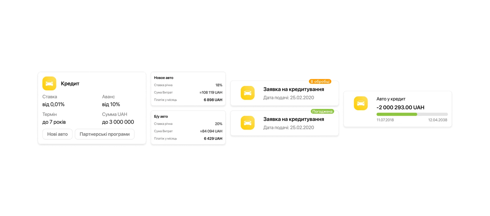
The outcome: a single entry point instead of 21 separate landing pages for calculating a car loan. A transparent calculation with program comparison, and a scalable architecture ready for new partnerships. Clear interpretation of financial terms and numbers for the user, with no hidden, unclear payments or fees: everything is in plain sight and in an understandable form. Tracking of a submitted loan application, with its statuses and the information you need. Unified loan management together with the other lending products. Due to external circumstances, the project was cut back after launch and some metrics could not be measured, but as a product the service was built from start to finish.
Context
People come for a loan with fear, and it is justified: the terms are opaque, and often that is a problem of design and interpretation.
The task: build a new loan type into auto lending and bring the customer journey in line with the bank's other lending products. This required synchronizing different teams and business lines around a shared architecture.
What did not work: the service was designed around a single program, with no choice of lending type; the user flow was not synced with the other loans. The web service had 21 separate landing pages, which made comparing programs against each other extremely hard, even though comparison is the customer's main need.
In the mobile version, two different jobs were merged: managing an active loan and calculating a new one. The application flow had no statuses; the user sent their data into the void and had no control over the process. You could not compare programs without an offline manager, which meant the online service did not cover the customer's main need.
The business needed a scalable system that solved all of these problems and allowed new programs and features to be added without rework. The user, in turn, needed transparency and the ability to compare and choose.
The hard part was not drawing a new landing page; it was that the system had to be rebuilt entirely: take apart the whole loan domain, connect it to the existing products, and not break scalability. That was the most interesting part: not the styling, but the untangling.
Approach
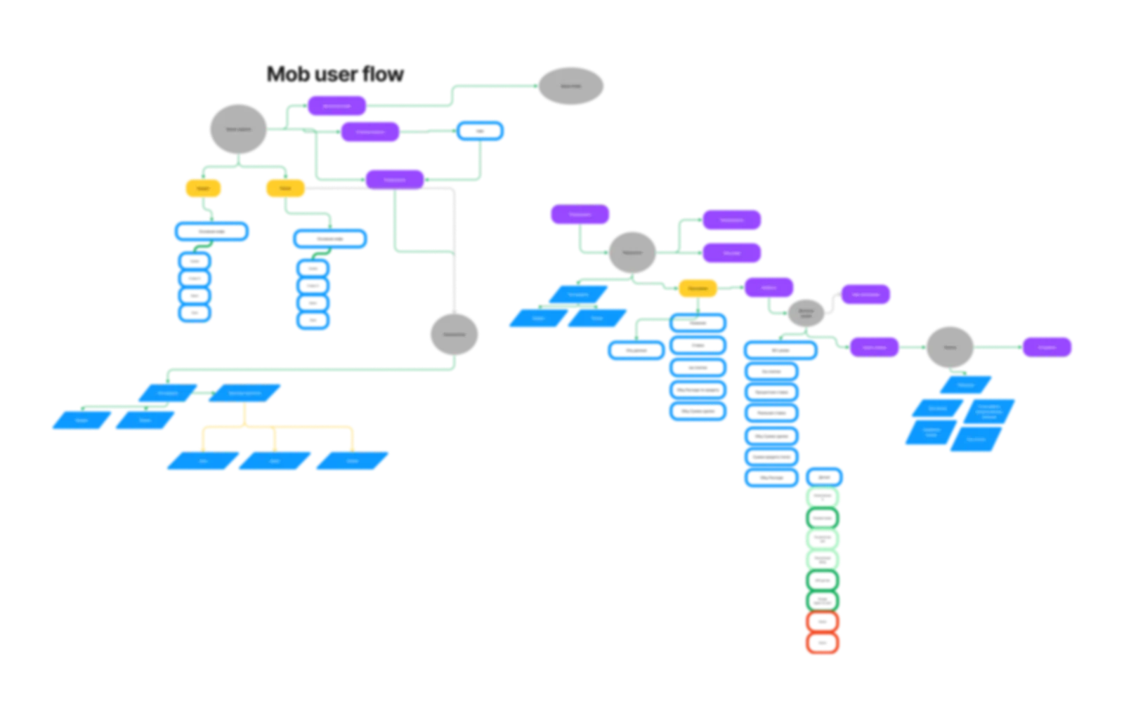
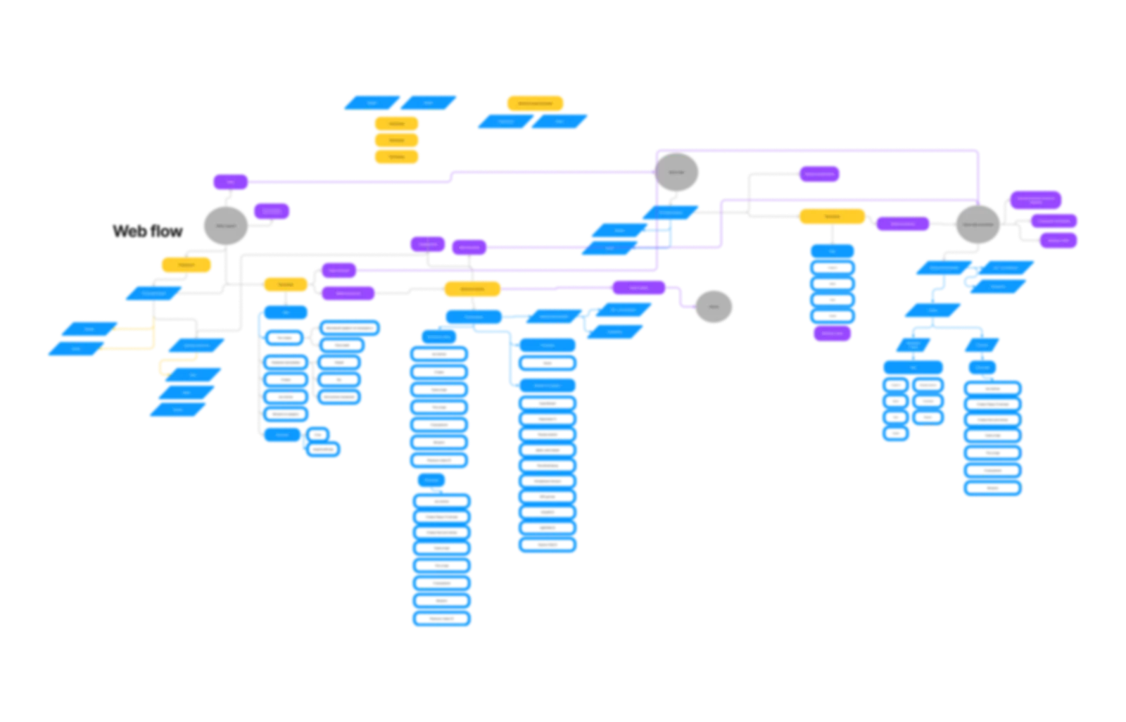
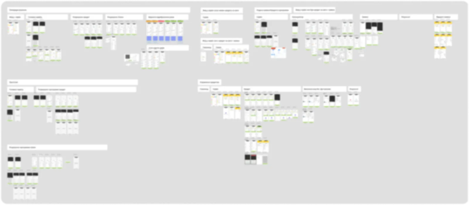
I went strictly in order: audit of the current service, domain research, decomposition, architecture, flow, mockups. I captured the as-is state: the service architecture, CJM, user flow, IA (iOS/Android). Each step rested on the previous one, and that is exactly what let me reach the finish solo, with no structural rework.
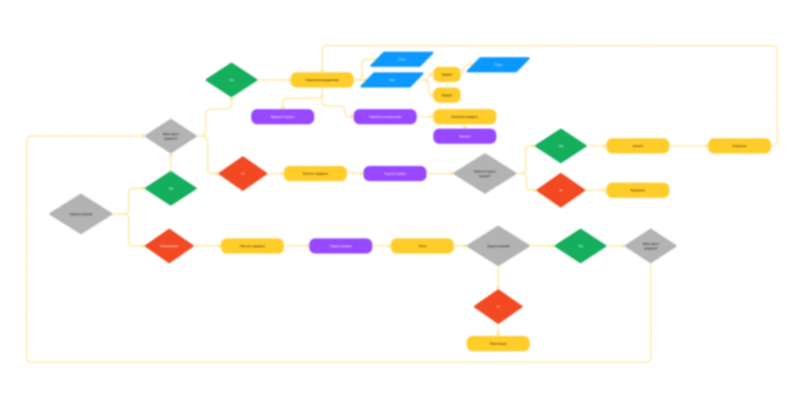
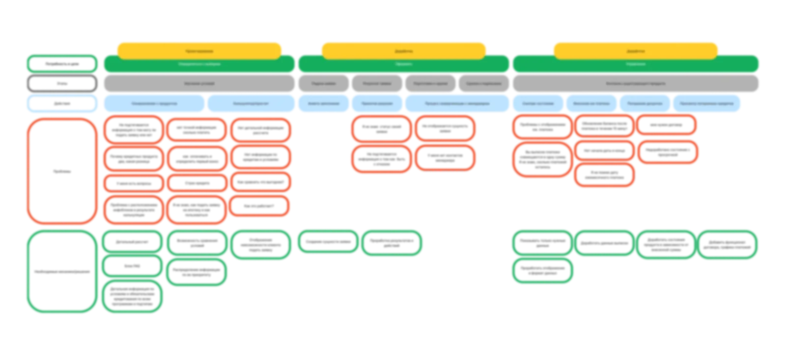
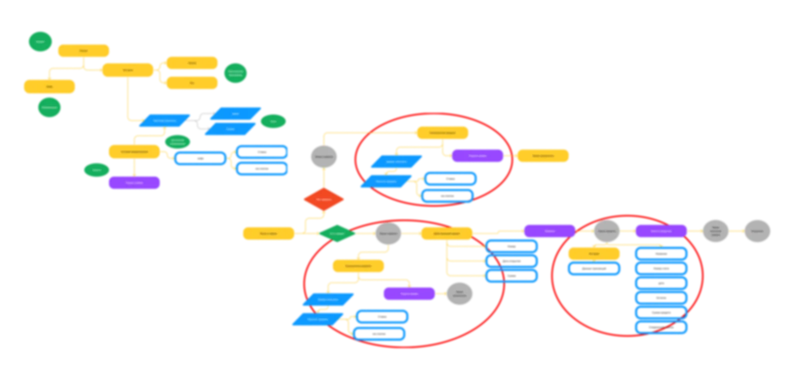
The core mismatch: that very blending of meanings, where an active loan and the calculation of a new one live on the same screen. But even without active loans, the old path would not do: the customer's core need is comparing programs, and the service could only show one. The base IA could not hold the new functionality.
As the next step, I figured out what a loan actually is. It is a relationship with two parts: the terms and the obligation. A designer cannot influence the terms, but conveying them clearly is exactly our job. A fork came up right away: the customer does not need a calculator that computes one option, but a configurator where they combine parameters and immediately see several results. And separately, there is the difference between a loan and leasing: with leasing, the customer does not receive money but property leased with a right to buy it out. Not everyone understands this, so I built an educational layer into the system from the start.
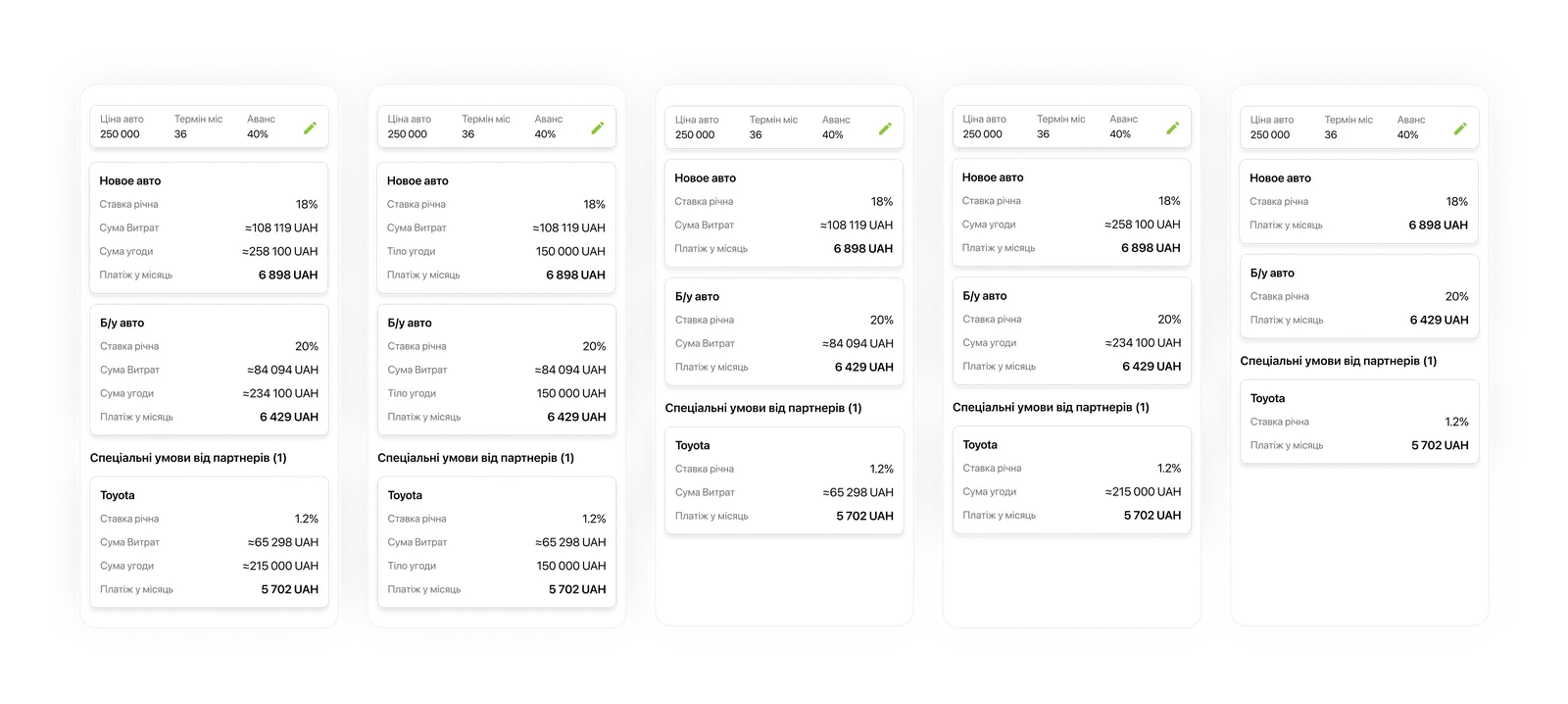
Behind a nominally low rate, mandatory services and one-off fees push the real cost of the loan several times higher. That real rate usually is not shown, and not out of malice: for banking specialists it is normal professional terminology. But a high interest rate hits the customer's emotions instantly, and emotions are not reasoned through, they are lived.
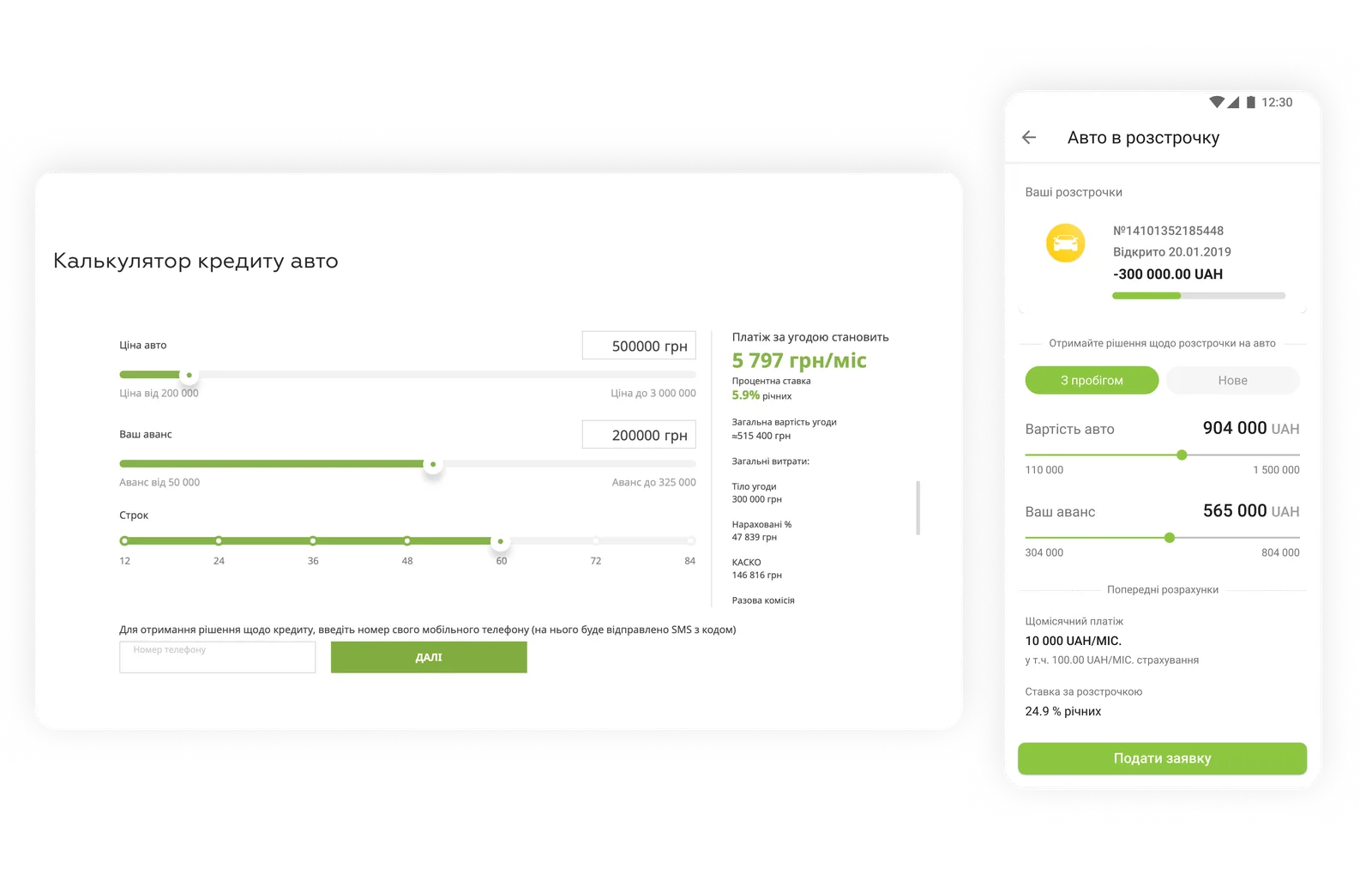
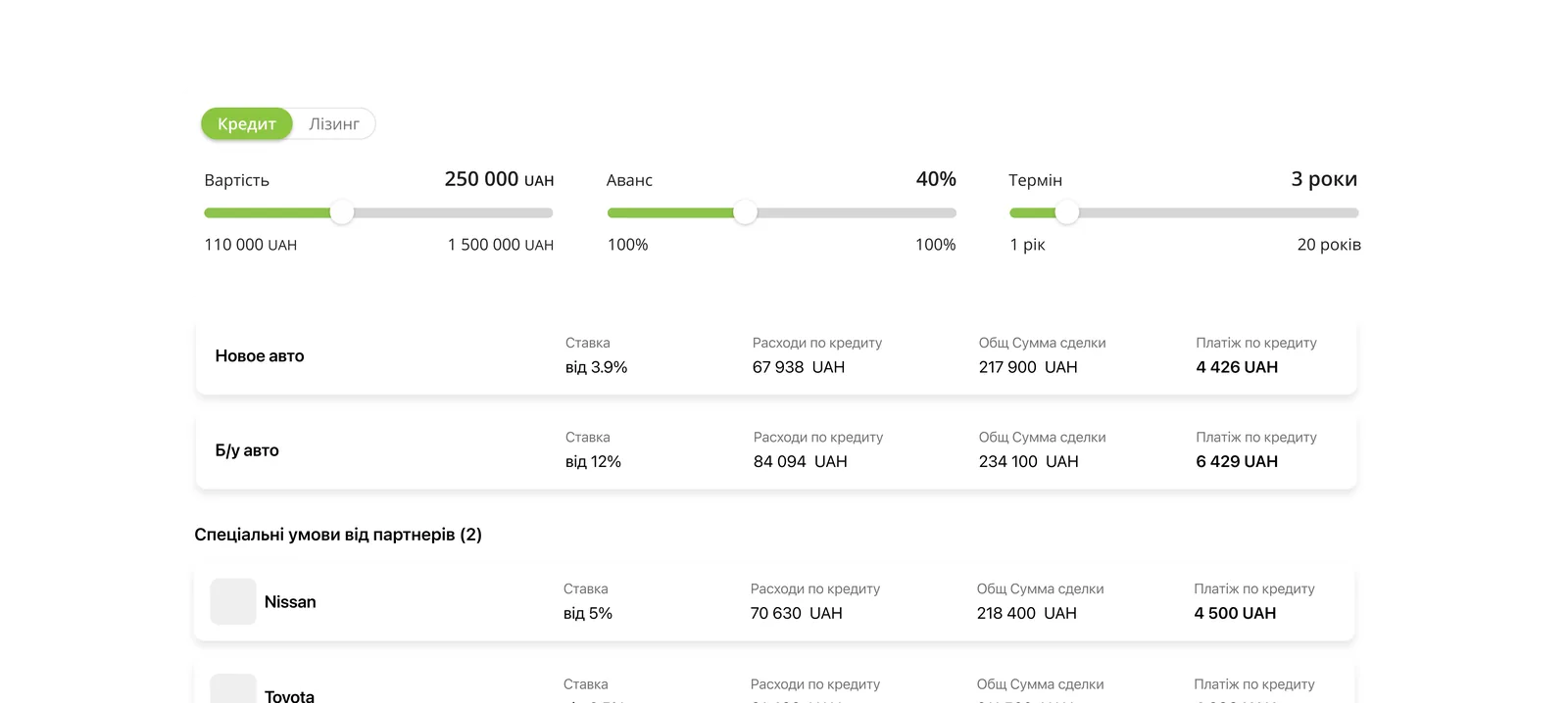
The insight. I turned the question around: the customer is scared by the rate, but accepts the absolute overpayment amount calmly, as a fair price for meeting a need here and now. So what we should show is the overpayment, not the scary percentage. That became the backbone of a very simple solution.
Since the app was meant to become a living calculator-configurator, I had to know exactly what could be compared and how. There are triggers the customer enters (amount, down payment, term), and there are obligations that follow from them: the interest rate, the monthly payment, the total deal amount, and the real rate. Changing one trigger cascades through and rebuilds the whole branch.

Final IA → user flow → mockups. From the chosen solution I assembled the final architecture, then the functional spaces and the end-to-end flow from it, and after that rough mockups for testing.
Options and testing. I designed and quickly tested several ways of presenting the calculation: fully transparent, where both the loan principal and the costs are visible at once; dry and business-like, where everything is hidden in the details; and a middle option, where the loan principal moves into the details to avoid a harsh contrast, while the total costs stay honestly on the main screen.
Solution
What made it into the product, looking at it by decisions rather than by screens:
Transparent math. We show the overpayment and the total cost instead of a hidden 'real rate.' The customer sees an understandable result, not a scary percentage.
A single comparison space. Switching between loan and leasing while preserving the calculations, and comparing programs within it, instead of 21 landing pages.
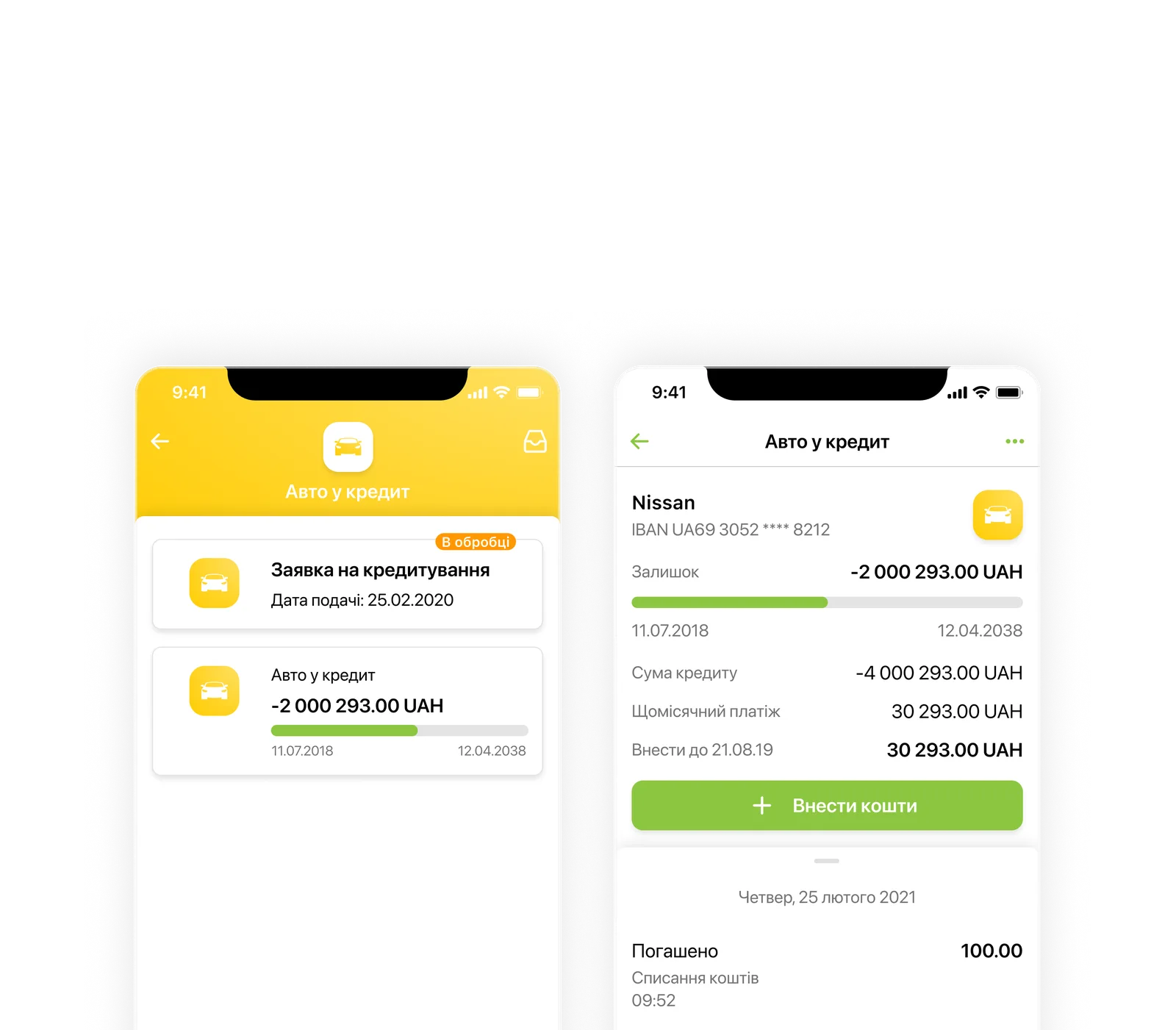
The application as a trackable entity. The customer can track the application's status at every stage.
Educational block. In plain language, it explains the difference: with leasing, the customer takes the car on lease with a right to buy it out (until it is paid off the car belongs to the bank, plus GPS and permission to drive abroad), while with a loan they own it outright from the start and travel abroad freely.
Sync with the other loans. A scalable architecture, synced with the bank's other loans, so new partner programs can be added without redesigning anything.
Conclusion
In fintech, transparency is the product. The strongest decision here is not in the interface but in the courage not to hide the overpayment and to present complex things clearly. In finance, honesty and directness ease fear better than any tricks.