Gamification in a Banking App
A large-scale gamification project in Privat24. The bank wanted to boost engagement through a game and broaden the basic online-banking usage scenario. At the start there were only ideas about the mechanics, zero architecture, a two-month deadline, and a launch across three platforms at once: Web (Responsive), iOS, Android.
I was the Lead Product Designer on the project. I owned the entire information architecture, the Service Blueprint, and interface design across all platforms, and I built the technical and organizational communication between ~40 people from several teams (Web, iOS, Android, Design, Business, Backend) and our partner, Mastercard. I assembled the information architecture from scratch in an online session with 15+ key specialists. We synced up right away, turned backend constraints into game mechanics, locked down all the states and functions, and finished refining the idea.
The result: over 7 weeks, 3 million of the bank's 14 million users took part, transaction activity rose by 25%, and it became the most successful gamification in the bank's history.
Context
People open a banking app to get something done: check the balance, transfer money, pay for a service. The bank wanted to raise engagement: bring users back to Privat24 more often and nudge them to explore its services (payments, transfers, purchases on the Mastercard card). The tool of choice was gamification. For the bank, this was already the fourth game.
The main challenge: the starting conditions and the tight timeline. We had to design and launch on three platforms at once, with different teams and a partner involved. Before development began, there was no single picture: what we were building, what objects the system consisted of, and how everything connected. Everything was done on the fly, without analytics, without a series of tests and iterations, without hypotheses. Given the size of the audience and the novelty of the mechanics, this was risky. That is what set the project apart from the others, where anything can be fixed later. There was no room for error, and that is exactly what made it interesting.
Approach
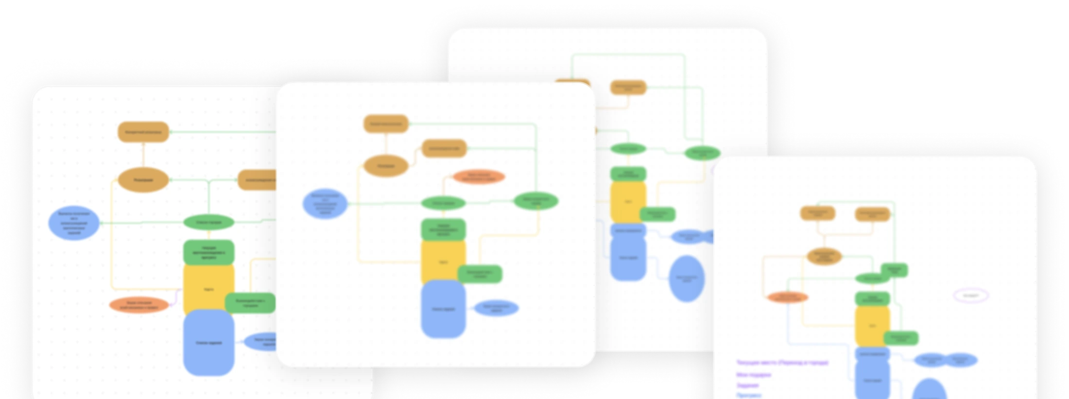
I designed the quest's entire information architecture top-down, in layers. Each new layer grew out of the previous one. First we assembled the overall structure of the quest from the teams' scattered ideas and JTBD notes: a single picture of what entities and objects exist in the system, what functions they have, and what we are building in the first place. The result was a solid OOUX (Object-Oriented UX) scheme. I built the architecture with room to spare for reuse and for changing the mechanics and the setting.
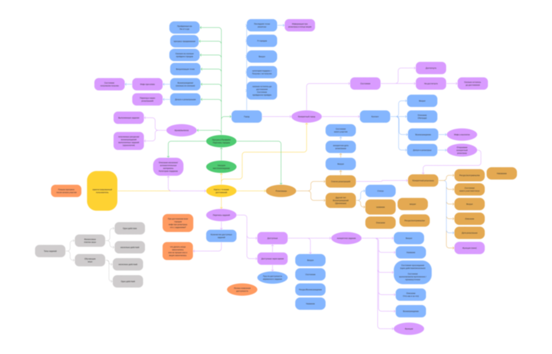
The key technique: I built the IA live. In general and technical meetings I asked questions, captured the answers on the spot, and extended the architecture right in front of everyone. The blueprint wasn't created in a vacuum; it took shape as a picture everyone had agreed on.
As the next step, I tried mapping functional spaces onto the architecture, identifying the system's objects, their relationships, and their actions, and that exposed hidden dependencies before development even started.
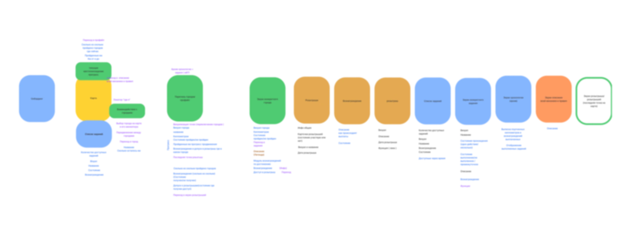
From the objects and relationships I built the navigation, with the journey map as the central hub. After that it became clear how the flow breaks down into screens and how navigation through the service would work.
Once I had an antifragile skeleton, I moved straight to design and prototyping. Thanks to this sequence, we reached the screens without structural rework: each layer rested on a proven one below it. For the rest of the project, I stayed the link between development and the business.
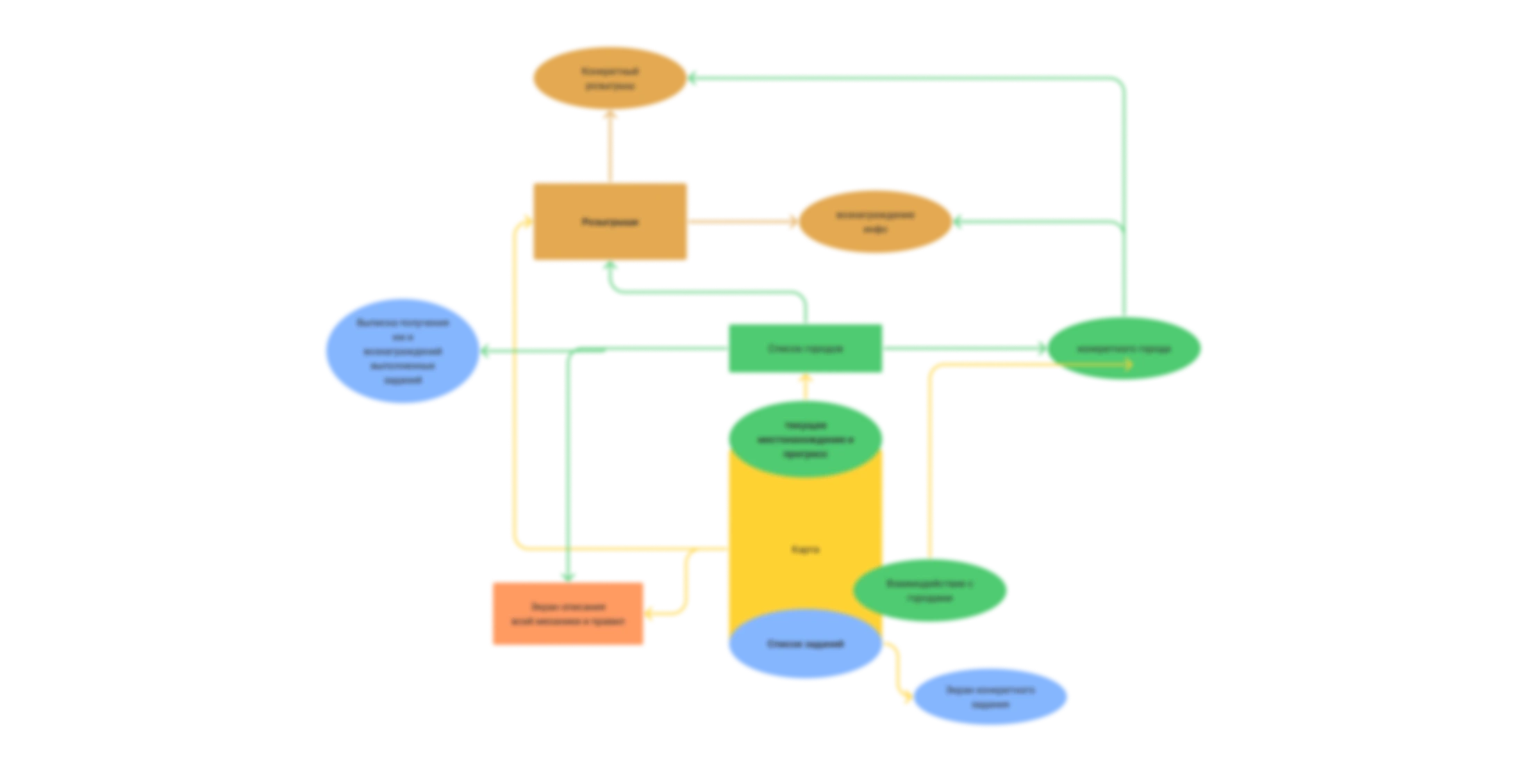
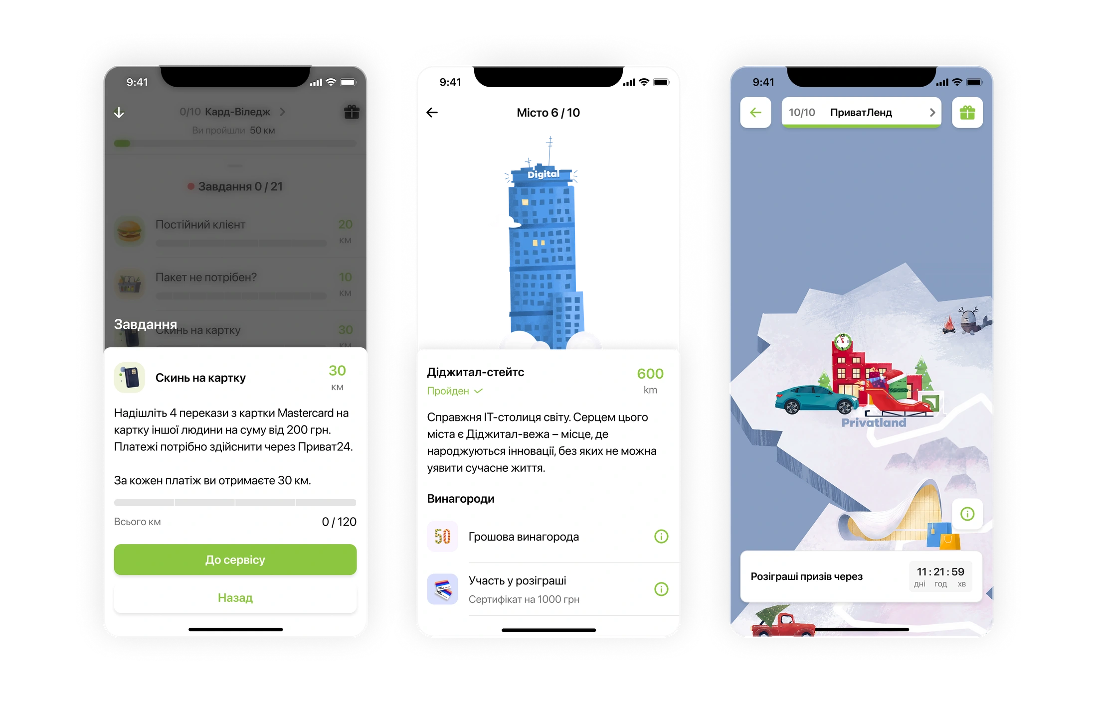
There were many constraints. One example: the game map was a 4000×4000 raster. To avoid crashing low-end devices, I derived a scaling formula based on screen width; the cities were served as separate @4x assets, and the path as a vector, so the coordinates could be bound programmatically. At the time, smooth frame-by-frame animation was tricky. I made the movement discrete, based on anchor points: the path between cities is split into fixed segments (10 km per point, and 100 points add up to 1,000 km to the finish), and the frontend animates the transition linearly. Progress, meanwhile, ripens in the background: if an action happened offline, the next time the user logs in, the interface elegantly plays out the new kilometers. This way, the technical limits became part of the game mechanics rather than a compromise.
Solution
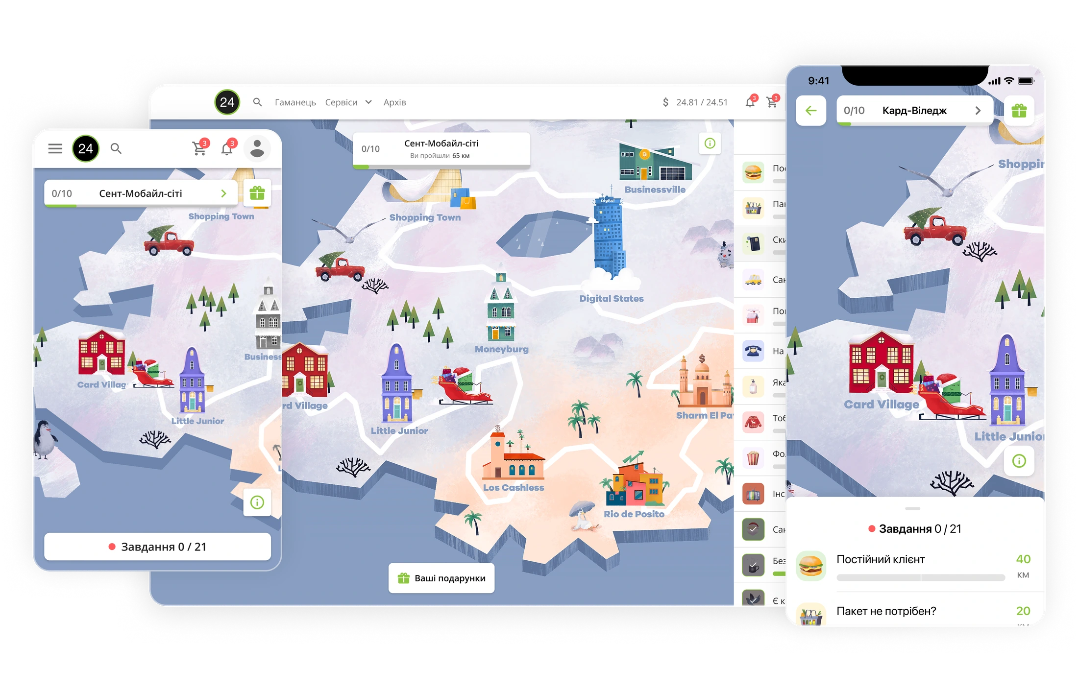
The player guides the bank's mascot, Cardman, toward the fairy-tale PrivatLand across 11 cities by completing tasks: real actions in the app and purchases on the card. Tasks earn in-game kilometers: the more kilometers, the closer to the goal. As you progress, you unlock cash rewards and prize draws (gift certificates, electronics); the grand prize is an Audi Q3.
The core loop has three steps: engage (story, plot, gifts) → complete a task (real action → resource) → reach a reward point (a prize and momentum to keep going).
Three product decisions set this quest apart from the bank's previous games, and I had to reflect each one correctly in the architecture and navigation. First, tasks no longer ran strictly in order; you could complete them in any sequence. Of the 21 tasks, some were open right away, while the rest unlocked along the way and kept interest up throughout the campaign. Second, every participant got a guaranteed benefit: cashback for the kilometers they earned. Finally, for the grand prize draw you did not even have to finish the quest: what mattered was reaching the required number of kilometers. That lowered the barrier to entry.
Impact
The service was designed, built, and launched across all three platforms in 8 weeks, and it ran for another 7 weeks after launch. Engagement was strong: very high retention and almost full conversion to completion. Most of those who started reached the end. The quest became the bank's most successful gamification by number of participants and by engagement.
Based on materials from AIN.UA link
Takeaways
The project was incredibly dense: at the peak, up to 25 meetings a day. In the early phase, I ran some of the meetings as a business analyst: describing the product and aligning understanding between the teams, the business, and the partner. My main personal takeaway: at this scale, the value lies not so much in mockups and metrics as in the ability to assemble the big picture, keep it in focus, and be able to convey it to everyone. Building the IA live, in front of everyone, proved both engaging and faster than any after-the-fact sign-offs: the solution was born and locked in within a single conversation.